Image Compressor: The Essential Tool for Faster Websites and Better User Experience
In today’s digital landscape, image optimization is critical for website performance, user experience, and SEO rankings. This comprehensive guide explores everything you need to know about image compression, from understanding the technology behind it to implementing best practices for your website.
Why Image Compression Matters for Your Website
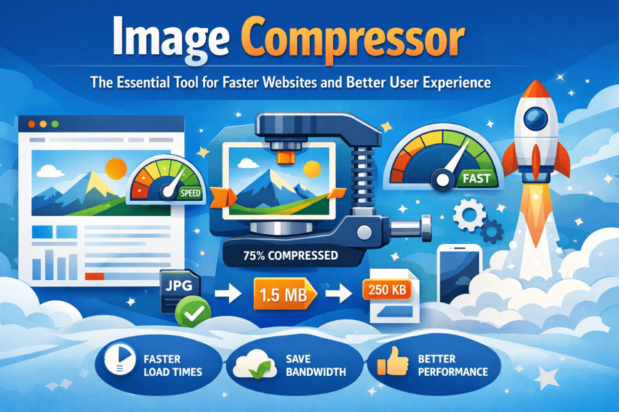
Fast websites rank better on search results. Heavy pictures that aren’t compressed often cause delays. Most people leave if nothing shows up within three seconds.
Picture files get smaller when compressed, yet still look sharp. Speedy page loads come from lighter images, which also sip less data – users tend to stay longer as a result. Companies see real gains: more customers complete actions, plus their sites climb in search results.
Understanding Image Compression: Lossy vs. Lossless
One way to shrink picture files focuses on keeping quality high. Another method cuts down size more aggressively, trading detail for space. These paths handle images based on what matters most – clarity or efficiency
Every single pixel sticks around when you use lossless compression. Instead of tossing anything out, it just packs the data tighter. PNGs go this route by default, so they work well for logos, sharp graphics, or anything needing see-through parts. Even though these files take up more space compared to compressed versions that cut details, nothing gets lost. The clarity holds strong from start to finish.
Here’s how it works: some details get tossed out on purpose, mainly stuff people won’t really see. Take photos saved as JPEGs – they rely on this trick, fitting neatly into tight spaces without obvious flaws. Picture something shrinking by up to 90%, yet still looking sharp enough for most eyes. Clever math decides what vanishes, keeping only what feels necessary.
Key Features to Look for in an Image Compressor
A good image compressor stands out by what it offers beyond simple shrinking. Some handle quality without making files blurry. Others adjust settings quietly in the background. Speed matters just as much when batches are large. A few keep colors looking natural after shrinkage. Tools differ in how they balance size against detail loss. Support for many formats helps avoid conversion steps. What works today might not suit tomorrow’s needs
Fresh batches of pictures? Handle them all at once instead of one by one. Working through full photo collections gets quicker this way. Instead of waiting, start everything together and move on.
Bouncing between image types? Try shifting a JPEG into WebP or turning PNGs into JPEGs. One way to nudge quality and file weight toward something that works. Choices like these often reshape how space and clarity play together.
With Quality Control, pick exactly how compressed a file gets. You choose the balance – less space, more detail lost. Fine adjustments mean smaller sizes without guessing. What matters most? How sharp it stays versus how small. Decisions stay yours. Compression bends to your needs, not the other way around.
What you see is a split view – compression applied versus original – so choices become clearer without guessing. Each adjustment reveals its effect instantly, removing doubt step by step.
When it’s necessary, keeping metadata means details such as where a photo was taken stick around. Settings from the camera used show up later because they are saved along the way. Copyright facts remain visible since the system holds on to them quietly.
Popular Image Formats and When to Use Them
Most photos you see online stick to JPEG format because it handles colors smoothly. Compression works well here, shrinking file size without obvious quality loss. Yet transparent backgrounds? Not possible. For posts on blogs, shots of items for sale, or wide banner visuals, this type stays a go-to choice.
PNG handles crisp lines well while allowing transparent backgrounds – perfect for logos, icons, screen images, or visuals with readable text. Still, those files often take up more space compared to similar JPEGs.
These days, most browsers understand it well, so sites built for tomorrow lean on WebP. A fresh format, it squeezes images smaller than JPEGs or PNGs without losing quality – transparent layers? Animated clips? Handled just fine.
Pictures stay sharp no matter the size when using SVG – great for logos or basic artwork. Since these files grow or shrink smoothly, they fit any screen. Tiny file sizes help websites load fast while adapting well across devices.
How Image Compression Improves SEO Performance
Search engines prioritize user experience, and page speed is a significant component of that experience. When you implement proper image compression, you address multiple SEO factors simultaneously.
Page Load Speed directly influences search rankings. Google’s Core Web Vitals metrics specifically measure loading performance, interactivity, and visual stability. Optimized images contribute significantly to passing these assessments.
Mobile Optimization becomes easier with compressed images. Mobile users often have slower connections, and lighter images ensure your content remains accessible regardless of network conditions.
Crawl Efficiency improves when your pages load faster. Search engine bots can crawl more of your website within their allocated crawl budget, potentially indexing more pages.
User Engagement Metrics such as bounce rate and time on site improve when pages load quickly. These behavioral signals indirectly influence your search rankings.
Best Practices for Image Optimization
Before adding pictures to your site, make them smaller first. Instead of using code to shrink images, adjust their size beforehand. When a photo spans 3000 pixels but shows at 800, it uses more data than needed. That extra load drags down how fast pages appear.
Start by loading images that fit each screen. Browsers pick the right size when you set up srcset. That way, phones won’t pull in heavy desktop versions. Smaller screens get lighter files – automatically. The result? Faster loads without wasted data.
Wait to load images that are lower on the page. As someone scrolls closer to those pictures, then they begin to appear – this makes the site feel faster right at the start. Instead of grabbing everything at once, only fetch what’s needed soon.
A hero shot often needs less squeezing to keep its impact. For thumbnails, though, tighter compression usually does just fine. What matters is matching the squeeze to where the image shows up. Featured photos lose too much if compressed hard. Tiny pictures? They handle heavy crunch without showing damage.
Start by using a system that delivers web content faster through smart image handling. This setup picks newer file types depending on what the visitor’s browser supports. Picture quality adjusts without extra steps from you. Some tools change older formats into efficient ones behind the scenes. Speed improves because files are smaller yet clear. The process runs silently each time someone views your site. Efficiency comes from matching tech to user devices. It works best when format shifts happen in real time. Your audience gets visuals fast regardless of connection strength. Automatic tweaks help reduce load times naturally.
Common Mistakes to Avoid
Picture quality suffers when squished too much – fuzzy details, odd color stripes, a messy look overall. See how it really appears by checking the image full-size before going live.
Skipping the right file type causes problems. Photos saved as PNG, or text images turned into JPEG, end up bigger than they need to be.
Missing alt text means leaving value behind. When shrinking image files, include clear descriptions so everyone can understand them – this helps both users and search visibility.
Most folks forget phones when they design just for big screens. To check how pictures look, try them out on different gadgets instead of guessing. Performance shifts from one device to another, so seeing is better than assuming.
Measuring the Impact of Image Compression
Ahead of tweaking images, try running a test with PageSpeed Insights or GTmetrix. Since results show exactly where delays happen, changes become easier to track. After compressing visuals, run the same check again – this time differences stand out clearly. Each tool gives concrete tips instead of vague advice. Load speed shifts appear in numbers, so progress is visible. Even small adjustments reflect in the scores shown afterward.
Start by checking your site’s Core Web Vitals in Google Search Console. LCP matters a lot – this one usually ties back to how fast images load. Watch it closely.
When users stick around longer, it usually shows up in lower bounce numbers. A shift in how many pages they view each visit can signal something’s working. Better results at the finish line – like completed signups – tend to follow when loading feels seamless. Watch these signs over time; they quietly reflect changes under the hood.
Quick websites start with squeezed pictures – no way around it these days. One smart move swaps big files for small ones without trashing how things look. Picture clarity matters, yet so does speed when pages wake up in browsers. Some methods chop data lightly, others go hard depending on what image type shows up. Tools pop up everywhere but only few fit real needs beyond basic clicks. Try one method, then another until loading times drop like stones. Every visitor notices snappy screens even if they never say it out loud. Search bots crawl quicker through lean sites packed with clean visuals. Good choices here ripple outward whether people scroll slow or fast. Smooth results come from testing, adjusting, repeating behind the scenes. No magic fix exists though habits shape outcomes more than luck ever will.
Picture this: go through your existing photos one by one. Spot the bulky ones first. Tackle those with smart shrinking methods, step by step. Faster loading grabs attention better. Google notices cleaner performance too. All that work? Pays off faster than expected.

Shivam AI Tools provides simple, fast, and reliable online calculators to help users plan better and make informed decisions. Our tools are designed for ease of use and educational purposes only
Our Services Tools
Our Services Tools
Contact Us
Best Development Company Shivam Software Raipur Chhattisgarh
+91 9669251442
shivampandey22798@gmail.com